Figma is, at best, a set of suggestions. All that matters is what makes it into code.
Even worse, design systems in Figma are a lie. Pretty, collaborative, and full of backdoors and loopholes. It's too easy to override, detach, and forget what the rules even were. Without something watching the code, drift is inevitable, even if everyone means well.
At scale, manual redlining is a disaster. Every pixel-perfect mockup turns into a game of telephone, and by the time it reaches production, the details have slipped.
You can't hire enough designers to chase down every override or one-off, and without automation in the loop, it's just a matter of when things drift, not if.
And the bigger the team, the faster it happens.
We've felt it at Builder. We've seen it in the wild. And thanks to some very candid numbers from teams like Shopify, Uber, and GitHub, we've got a pretty clear picture of why it happens, and what actually reins it in.
Shopify found that after a year, 14% of their admin UI had wandered off the Polaris mainline. This was despite strong adoption and a coverage dashboard watching it.
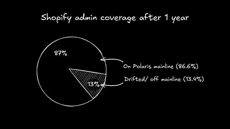
Even at Shopify scale, drift creeps in. And those stray 14% still mean real rework.
Even Figma knows this is a thing. They literally added "detached instance" analytics so you can track how often people break away from the system.
We've seen it at Builder. A poor design system workflow can actually slow you down more than having no system at all. I've watched designs break out of system requirements without anyone noticing. Suddenly we're redlining, one-off styling, duplicating work, and wondering why something that's supposed to save time is now the bottleneck.
Once the gap opens between design and code, drift has a way of accelerating.
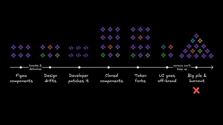
One bad override can snowball fast.
- Manual reviews don't scale. Redlines get skipped when the sprint's on fire.
- Tokens get forked. "Just for this use case" turns into three variations nobody remembers making.
- Components get detached. Now you're fixing bugs in five places instead of one.
Jeremy Dizon documented his org's detaches doubling in a year when their library lagged.
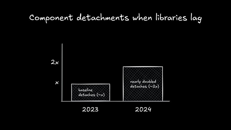
Swap "X" for your own baseline if you want to make the pain hit home.
Uber puts it bluntly, by the time you spot inconsistencies, it could be too late.
The teams beating drift aren't doing it with more process docs, they're baking adherence into their tools. The goal is to make the right way the path of least resistance.
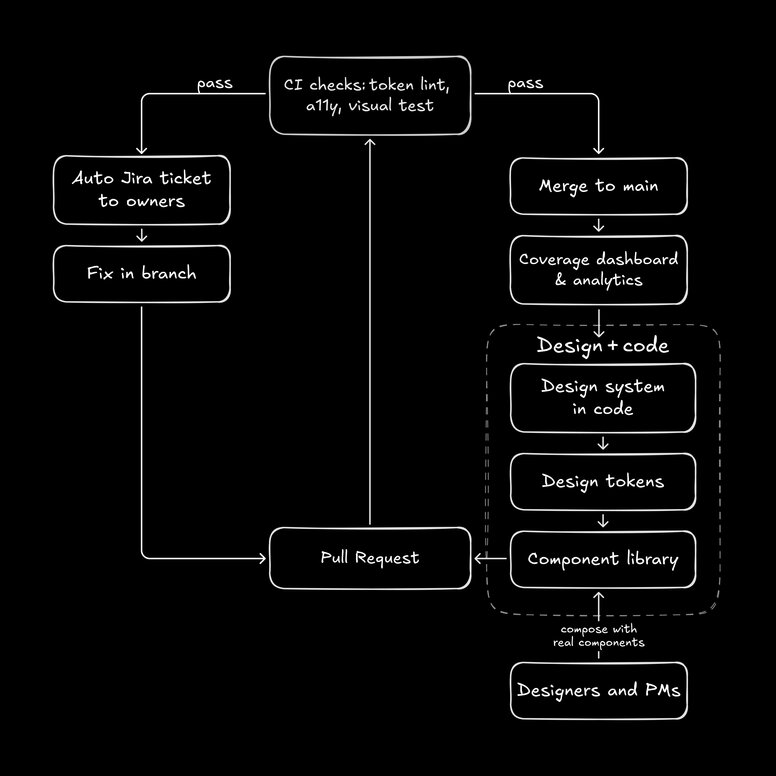
Governance isn’t a PDF. It’s a loop baked right into your stack.
- One source of truth in code. Shopify uses coverage dashboards and linting tools to keep everything on Polaris mainline.
- Guardrails, not unlimited freedom. Uber's CI checks block merges when system rules are broken, automatically filing Jira tickets for fixes.
- Observability. Treat adherence like a quality metric: dashboards, counters, alerts.
This is where AI can do more than speed up tasks, it can enforce governance without slowing anyone down.
We have our designers work directly in a Figma-like editor that's actually in code, with the design system baked in, using Fusion. Every pixel they perfect is already production-ready. When a DS update happens, AI can apply it in code, send the pull request, and let the designer oversee the details, no begging engineering for cycles.
And yes, AI helps here. GitHub runs an accessibility and token check on every pull request. Any violations get caught before merge. No big meeting, no finger pointing, just "fixed in PR."
If you're curious how to bring this into your own process, check our design to code page for a deeper look at how we connect real components, tokens, and visual editing, or our prototyping page for how we design in code.
Governance isn't about locking creativity in a closet. Sometimes you need to break the rules, a marketing splash page, a new homepage hero, a one off experimental UI.
The difference is intentional vs accidental. Without guardrails, every deviation is an accident. With them, breaking the system becomes a design choice, and you can flip it off when you're done.
As one of our designers put it, "I don't want the freedom to reinvent buttons. I want the freedom to actually design."
That's why I'm fine breaking the rules intentionally, like for a new homepage hero or a splash page that needs to stand out. The key is that it's a switch, not a permanent fork. Turn it on when you need it, turn it off when you're done, and the rest of the system stays clean.
This has been one of the biggest surprises for us in this new wave of AI tools. With the right setup, it can become substantially easier to design and build using the best practices vs not, and now suddenly doing things the "right way" is people's default preference.
When you can simply say "give me a new dashboard" and get one that follows all of the correct conventions, and then from there make your tweaks, everyone has moved faster and been happier.
And if you feel like doing this will leave you missing Figma's beautiful drag and drop UI - try out Fusion. It's a Figma-like editor that lets you design directly in code, using your actual design system. I'd love to hear your feedback on it.


